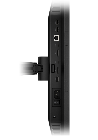
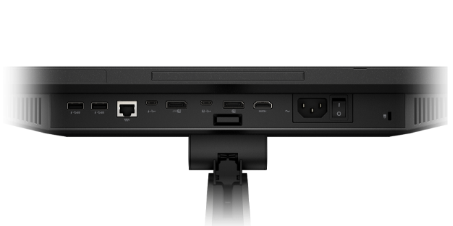
Category hotspots
Category hotspots is an informative tool that displays exciting new features by organizing them into categories.
All the ports you need for maximum productivity
For meetings, gaming, and everything in between.

WORK. SCHOOL. FUN. IT ALL LOOKS GOOD FROM HERE.

PERSONALIZED YOUR VIEW
TOTAL COMFORT BEGINS WITH HP EYE EASE
USB ports lorem ipsum dolar sit amet consectuor adipscing lorem ipsum dolar sit amet consector.


Usage
Category hotspots allow authors to organize multiple product features. These features are narrowed down based on category and visual representation.
Module specifications
- The background color is set to grey to comply with brand guidelines for all product-related content
- At least one category button should be fully configured
- Category buttons will carousel when buttons exceed the width of the module
- Color scheme of hotspots and buttons are configurable
- Multiple perspectives are supported e.g Top view, Bottom view
Character counts (with spaces)
- Category Descriptor Subhead: 148 character count (2 lines) and text will truncate after exceeding max count.
- Category Descriptor Body: 246 character count (3 lines) and text will truncate after exceeding max count.
- Hotspot title: 101 character count
- Hotspot body: 199 character count
Example layouts
Category tabs exceed width (carousel), desktop
Module with no categories chosen (tighter spacing), desktop
Category tabs exceed width (carousel), tablet
Module with no categories chosen (tighter spacing), tablet
Category tabs exceed width (carousel), mobile
Module with no categories chosen (tighter spacing), mobile
Resources
For Zeplin access contact the UX Design Manager
Components can only be copied from our library, unless you belong to our HP Enterprise Figma instance.


