Use Case Card
The use case card features information cards showcasing why a product or service is right for a target customer.
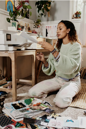
This module combines imagery with multiple levels of text and CTA content.

What’s Crowdsourcing?
This could be your header. Folding @home is an initiative that utilizes a small fraction of processing
Folding @home is an initiative that utilizes a small fraction of processing power from computers around the globe, to achieve massive results. Folding @home is an initiative that utilizes lorem ipsum dolar sit amet consecutor adipsing.
Power of a cure
You can make your apps smaller on screen and still have the clarity you need. This allows more apps on screen, 15 more excel columns, and more multitasking.

Positive impact
The higher the resolution, the more content you can see on your screen. With more pixels, you can make your content smaller in size and still see with the clarity you need.
Usage
The use of images and focused descriptor text allows the user to easily toggle through product information. Use this module when you want to exhibit specific product features or services.
Module specifications
- This component can be placed into a column or grid control to achieve a carousel
- Featured image and title will remain the same for collapsed and expanded card
- Title font style and color is configurable
- 3 or more cards can be stacked or carousel
Character counts (with spaces)
- Module Headline - 120 max characters
- Card exterior copy - 80 max characters
- Card interior copy - 230 max characters
Example layouts
Card default view and expanded view
Desktop view with 2 cards minimum
Tablet showing two use case cards
Mobile showing three use case cards stacked
Resources
For Zeplin access contact the UX Design Manager
Components can only be copied from our library, unless you belong to our HP Enterprise Figma instance.
Country/Region :
United States
Select Your Country/Region and Language
- Africa
- Afrique
- América Central
- Argentina
- Asia Pacific
- Australia
- Bangladesh
- België
- Belgique
- Bolivia
- Brasil
- Canada
- Canada - Français
- Caribbean
- Česká republika
- Chile
- Colombia
- Danmark
- Deutschland
- Ecuador
- Eesti
- España
- France
- Hong Kong SAR
- Hrvatska
- India
- Indonesia
- Ireland
- Italia
- Latvija
- Lietuva
- Magyarország
- Malaysia
- México
- Middle East
- Nederland
- New Zealand
- Nigeria
- Norge
- Österreich
- Pakistan
- Paraguay
- Perú
- Philippines
- Polska
- Portugal
- Puerto Rico
- România
- Saudi Arabia
- Singapore
- Slovenija
- Slovensko
- South Africa
- Sri Lanka
- Suisse
- Suomi
- Sverige
- Switzerland
- Türkiye
- United Kingdom
- United States
- Uruguay
- Venezuela
- Việt Nam
- Ελλάδα
- България
- Казахстан
- Србија
- Україна
- ישראל
- الشرق الأوسط
- المملكة العربية السعودية
- ไทย
- 中华人民共和国
- 臺灣 地區
- 日本
- 香港特別行政區
- 한국
©2025 HP Development Company, L.P. The information contained herein is subject to change without notice.