Horizontal Content Switcher
This component combines imagery with multiple levels of text and CTA content.
Revolutionary screen design
Read the benefits of a dual-monitor setup from anywhere with an industry-first 6’’ 1080p touchscreen mounted above the keyboard.
Exquisite craftsmanship. Impressive power.
Exquisite craftsmanship. Impressive power.
500-sheet input capacity: two trays capable of holding different document sizes

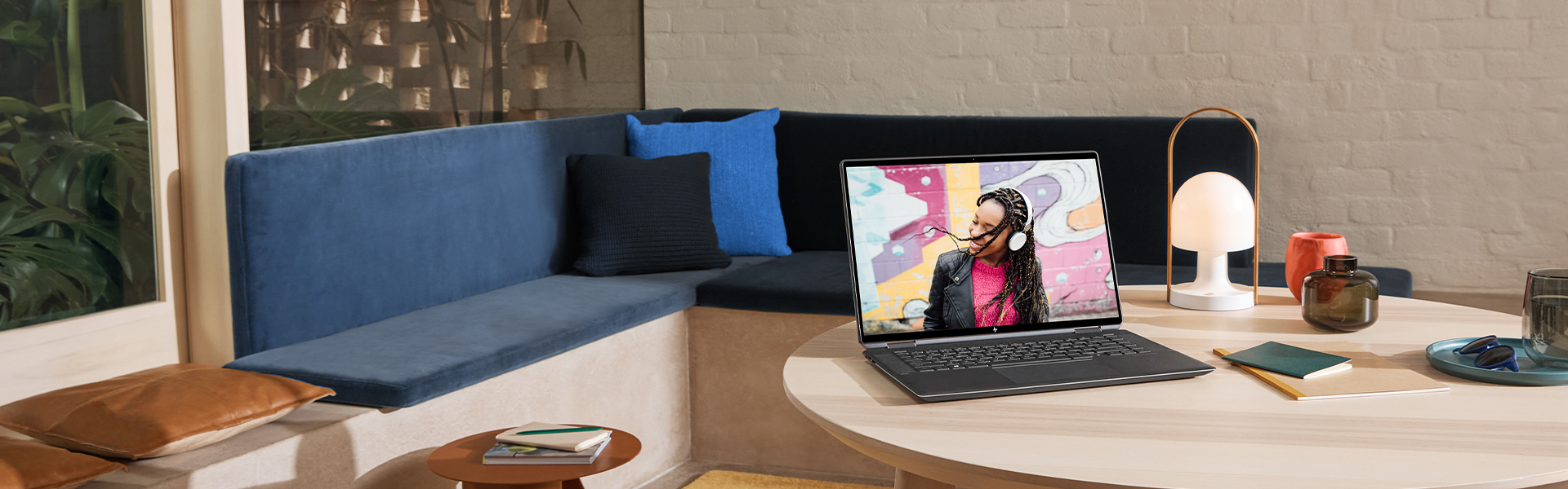
Looks stunning. Runs smooth.
Looks stunning. Runs smooth.
Performance gaming laptops and desktops that competition demands

Security
Security
Create editable, searchable documents scanning from your phone or printer.

New hourglass edge
New hourglass edge
Easy, convenient opening of your laptop from three sides
Usage
This module presents a single key point with multiple supporting points as an interactive set of hide/show captions and visual aids.
Module specifications
- Background, text and clickable arrow colors are configurable
- Media can support a static image or video for each card
- Option to use the same media for the entire. Upon user interaction, the card will expand, but the image will remain the same.
- Option to switch module orientation from left to right
- Minimun of 2 cards, maximum 4 cards
Character counts (with spaces)
- Component Headline - 60 max characters
- Subhead - 140 max characters
- KSP Tab subhead - 25 max characters
- KSP Tab (body) - 120 max characters
Example layouts
Desktop view with content left aligned and one open box with CTA
Desktop view with content right aligned and boxes closed
Default Tablet
Default Mobile
Resources
For Zeplin access contact the UX Design Manager
Components can only be copied from our library, unless you belong to our HP Enterprise Figma instance.
Country/Region :
United States
Select Your Country/Region and Language
- Africa
- Afrique
- América Central
- Argentina
- Asia Pacific
- Australia
- Bangladesh
- België
- Belgique
- Bolivia
- Brasil
- Canada
- Canada - Français
- Caribbean
- Česká republika
- Chile
- Colombia
- Danmark
- Deutschland
- Ecuador
- Eesti
- España
- France
- Hong Kong SAR
- Hrvatska
- India
- Indonesia
- Ireland
- Italia
- Latvija
- Lietuva
- Magyarország
- Malaysia
- México
- Middle East
- Nederland
- New Zealand
- Nigeria
- Norge
- Österreich
- Pakistan
- Paraguay
- Perú
- Philippines
- Polska
- Portugal
- Puerto Rico
- România
- Saudi Arabia
- Singapore
- Slovenija
- Slovensko
- South Africa
- Sri Lanka
- Suisse
- Suomi
- Sverige
- Switzerland
- Türkiye
- United Kingdom
- United States
- Uruguay
- Venezuela
- Việt Nam
- Ελλάδα
- България
- Казахстан
- Србија
- Україна
- ישראל
- الشرق الأوسط
- المملكة العربية السعودية
- ไทย
- 中华人民共和国
- 臺灣 地區
- 日本
- 香港特別行政區
- 한국
©2025 HP Development Company, L.P. The information contained herein is subject to change without notice.