Small info banner
A small multi-use container that can display two layers of related content
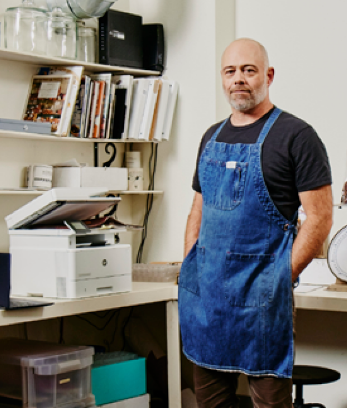
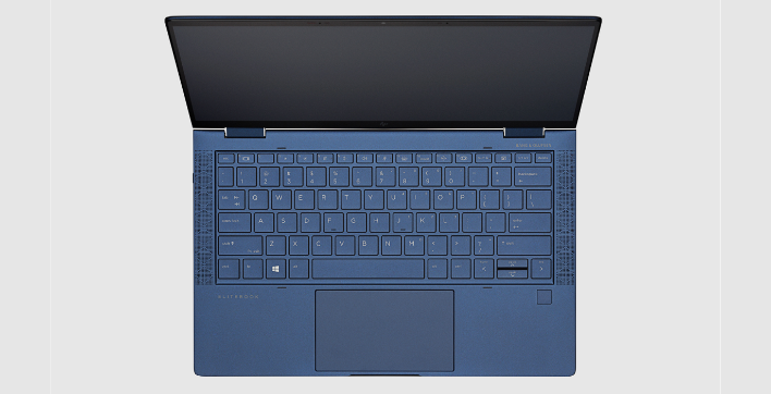
Innovation
Help avoid frustrating reprints, wasted supplies, and delays.
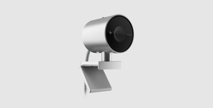
HP 950 4K Webcam
Look good from every angle

Security
From the cartridge design to programming and installation, packaging, and tracking, HP implement security features to help provide product integrity.
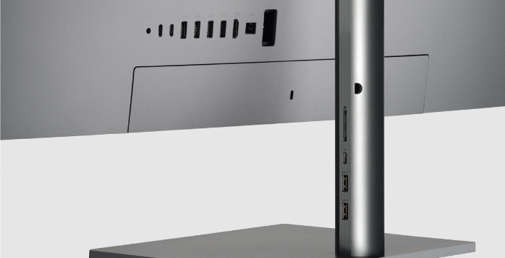
HP U32 4K HDR Monitor
See your imagination with more detail.
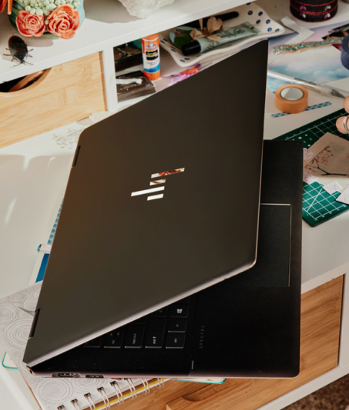
Immersive
High performance for complex data tasks
HP 950 4K Webcam
Look good from every angle
Usage
This component allows users to layer levels of imagery and content to tell multiple levels of a product story.
Module specifications
- Option for 1 banner: center aligned
- Option for 2 banners: side by side
- Option for 3 or more banners: auto carousel (no max)
- Module background color is configurable
- Caption (eyebrow) is optional
- Static image or video allowed in both image areas
Character counts (with spaces)
- Card title - 80 max characters
- Card description - 120 max characters
- Component eyebrow - 80 max characters
- Component title: 120 max characters
Example layout
2 column Desktop layout
Tablet carousel option
Mobile carousel option
Resources
For Zeplin access contact the UX Design Manager
Components can only be copied from our library, unless you belong to our HP Enterprise Figma instance.
Country/Region :
United States
Select Your Country/Region and Language
- Africa
- Afrique
- América Central
- Argentina
- Asia Pacific
- Australia
- Bangladesh
- België
- Belgique
- Bolivia
- Brasil
- Canada
- Canada - Français
- Caribbean
- Česká republika
- Chile
- Colombia
- Danmark
- Deutschland
- Ecuador
- Eesti
- España
- France
- Hong Kong SAR
- Hrvatska
- India
- Indonesia
- Ireland
- Italia
- Latvija
- Lietuva
- Magyarország
- Malaysia
- México
- Middle East
- Nederland
- New Zealand
- Nigeria
- Norge
- Österreich
- Pakistan
- Paraguay
- Perú
- Philippines
- Polska
- Portugal
- Puerto Rico
- România
- Saudi Arabia
- Singapore
- Slovenija
- Slovensko
- South Africa
- Sri Lanka
- Suisse
- Suomi
- Sverige
- Switzerland
- Türkiye
- United Kingdom
- United States
- Uruguay
- Venezuela
- Việt Nam
- Ελλάδα
- България
- Казахстан
- Србија
- Україна
- ישראל
- الشرق الأوسط
- المملكة العربية السعودية
- ไทย
- 中华人民共和国
- 臺灣 地區
- 日本
- 香港特別行政區
- 한국
©2025 HP Development Company, L.P. The information contained herein is subject to change without notice.